Regardless of whether you are building your own community, doing freelance work or working for a large company, at some point the question of creating reports that would summarize what is happening in your community arises. This moment is where problems usually begin: there are either no tools for data analysis at all, or so many that at the end of the day everything ends the same - doing tables and charts in Excel, and then print-screening them for the final presentation…
Creating reports is at least a day of painstaking work, which is repeated every month. When I worked as a data analyst at Stack Overflow, I often thought, what if it were possible to get all the necessary monthly charts for my report automatically? After all, we measure the same thing every single month.
Voila! Meet the Community Management Reports that are automatically generated every month for your community. They contain predictions, assessments, interpretations and you can download any of the images for your final presentation in one click!
Report structure
The main goal of the Community Management Reports is to make it easy to tell a compelling story about your community based on data. To do this, reports include the most important information about your community that is presented in several different ways so that you can use exactly what you need at a particular moment.
Each report consists of:
- Report status
- Key assessments
- Overview of metric trends
- Detailed view of each metric
Let’s look at each point in more detail.
Report status - a way to evaluate the entire report with just one value
The reports are built on the “pyramid” principle. Each top level summarizes the levels below. The higher the level, the fewer assessments (metrics) are and less information about each of the assessments is presented. So, at the very top level, we assess the entire report with only one assessment, which can have one the following values:
- Good. All metrics in a report show a good trend, the community is growing.
- Okay. Some metrics either do not grow or have a negative trend, your community may be stagnating.
- Needs attention. Most of the metrics in a report have a negative trend.

You can find the value of this assessment in the title of each report.
Key assessments - the most important trends
Key assessments are the executive summary of the report. The purpose of each assessment in this section is to describe the most important trend with a single number. Typically, this is either the current value of one of the metrics included in the report, or a summary of several metrics.
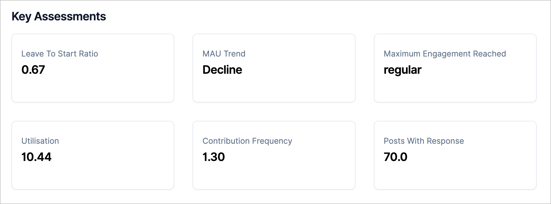
While the report status provides a single-number assessment, the key assessments section provides the values on the basis of which the report status is calculated.
Metric overview - summary of metric changes
Metric overview is a table with an overview of the change in values of all metrics included in the report. The purpose of this table is to provide a quick view to understand whether the metrics are increasing or decreasing year-over-year and month-over-month and how big the changes are.
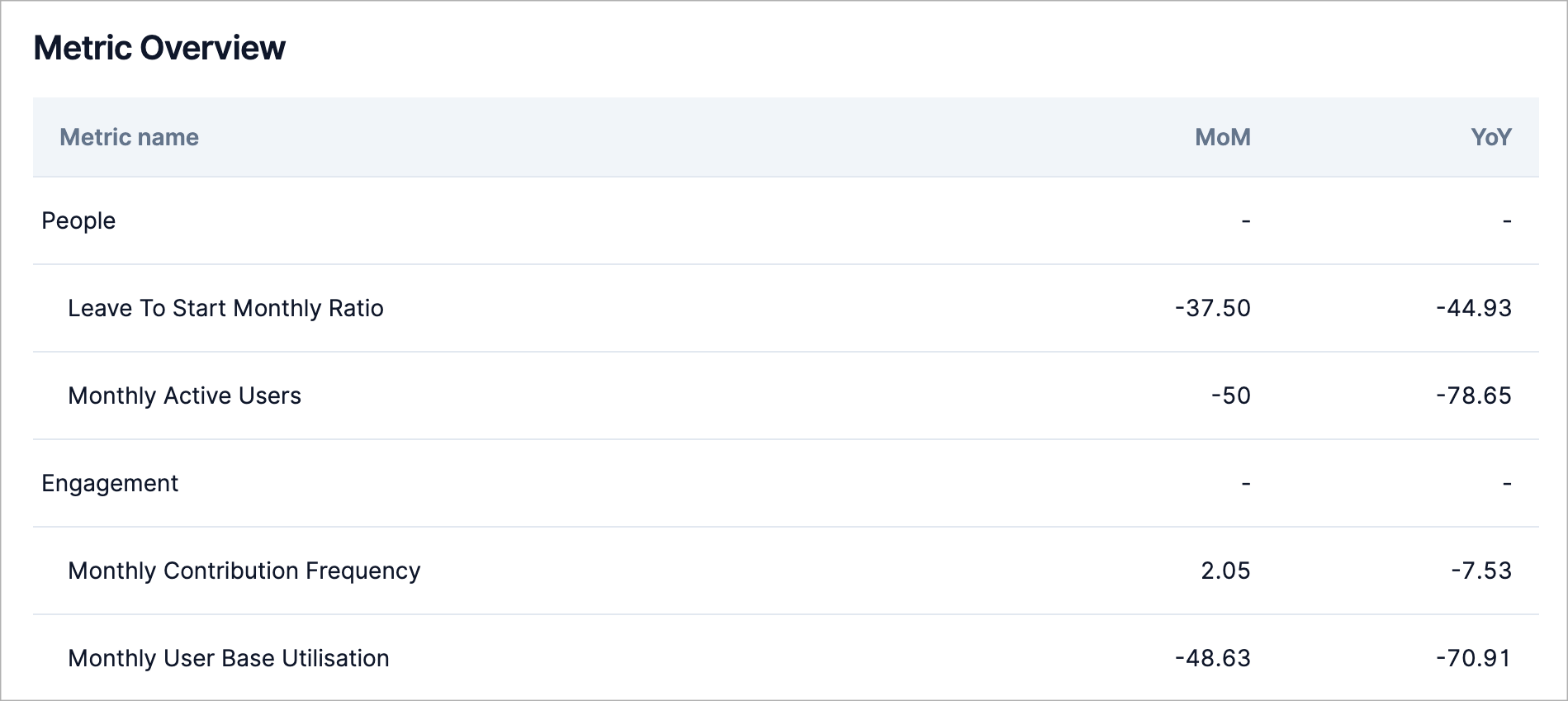
This table presents all the metrics on the basis of which the key assessments are calculated. Clicking on a metric in the table will take you to a detailed view (trend) of the metric.
Detailed view of metrics
All the previous sections provide various estimates of the metrics that the report is based on. In the detailed view section, you can explore the metrics themselves. Each metric has the following representation:
- A visual representation of a trend for the current and past calendar year.
- A forecast of the metric’s trend for the next 12 months.
- Point estimates: the current value of the metric, MoM and YoY.
- Recommendations for interpreting the metric’s value.
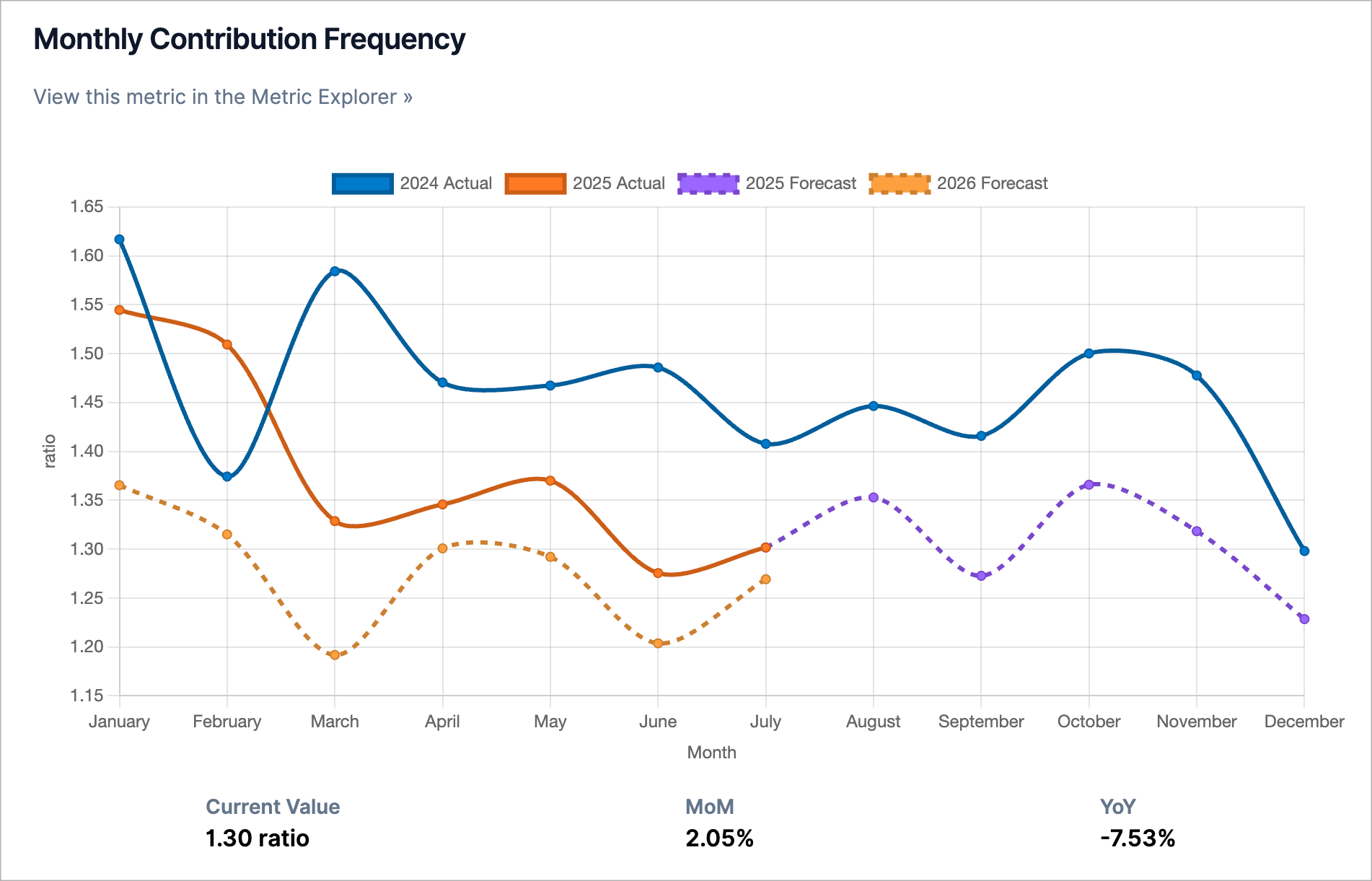
Each metric also contains a link to the Metric Explorer, where you can view the metric value for your community in even more detail. For example, in the Metric Explorer you can see the metric trend since the beginning of the community and get a comparison of the metric values in your community with the industry average..
A few notes:
- MoM stands for month-over-month and refers to the percentage change in a metric compared to the previous month. For example, if it is August 2025, then MoM will show the change between August 2025 and July 2025.
- YoY stands for year-over-year and refers to the percentage change in a metric compared to the previous year. For example, if it is August 2025, then YoY will show the change between August 2025 and August 2024.
- Some metrics have a time lag of one month. For example, the leave to start ratio. For such metrics, we display values for the month before the previous month (not for the previous month!)
- Each chart can be expanded and downloaded. Links to these actions are in the lower right corner of the chart. When saving, you can customize the size of the final image and the background of the image.
Motivation and how to create a report
In addition to assessments and specific metric values, each report contains a motivation for creating the report (i.e. when and why we need a specific report) and a short guide on how to create it. This allows you to understand why the report looks like it does and, if you want, how to create the report yourself (in case you don’t like automation!) If you are already an experienced user of our product, you can hide this section.
If you have any questions or suggestions, please feel free to ask them in the answers to this post or write me an email (nicolas.chabanovsky@gmail.com)!