Most metrics, whether it’s time to run a marathon or salary, can only be interpreted in the context of many possible values. Let’s say you’re looking for a community management job and you’re offered a position that pays $4k per month. Should you take it? You can only gauge the attractiveness of the offer by finding out how much other companies are offering you for similar work in your region. Likewise, to understand how well your community is doing, you need more than just knowing the metrics in your community; you need to determine where your metrics fall on the “success scale.”
How to use benchmarks
Okay, you have a community. How to measure the effectiveness of its development? Easy, with the Practical CM App!
- Find the metric you’re interested in in the metrics explorer. Read the metric’s description to make sure it answers the question of your interest.
- Measure the metric in your community according to the available guidelines in the app (or use the value the platform you use provides you with).
- Compare the resulting value for your community with a range of industry values in the app.
Let’s look at how it works using the monthly user churn rate as an example.
Let’s say my community had 1000 active users at the beginning of the month, 35 of which left the community. The churn rate than would be 3.5% (35 / 1000 * 100%). Now let’s go to the churn rate page where we see the following:
- Average value
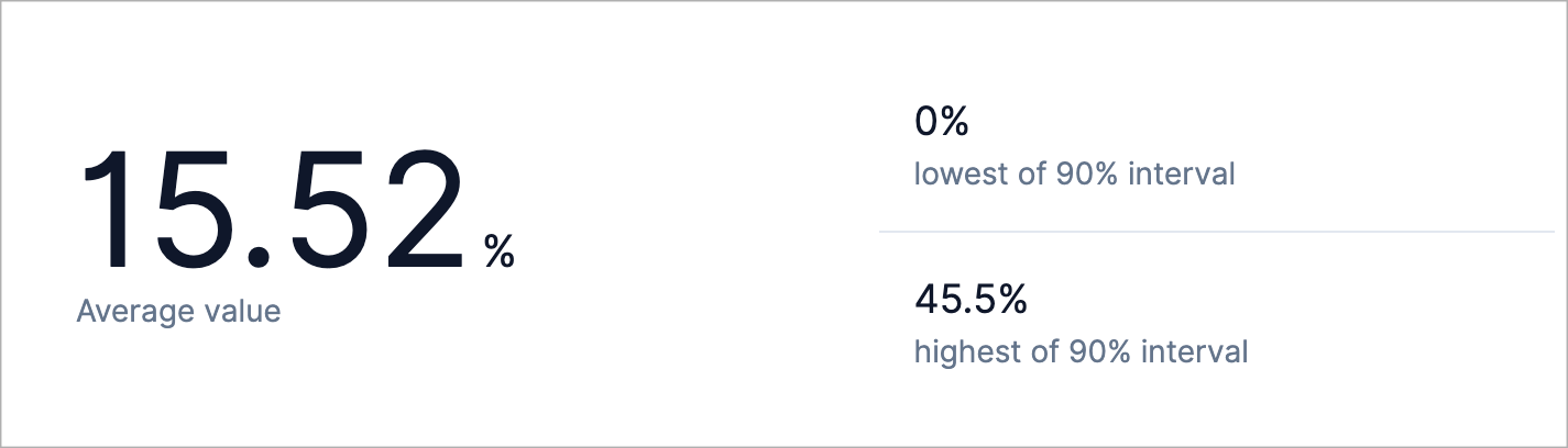
The average value is a value that you can use in most cases. In the context of our example, the average is 15.52%. This means that on average, out of 1000 users at the beginning of the period, 155 will leave an abstract average community. In our case, this is only 35 users, which means that our churn rate is well above the average. Yay! We are doing a great job!
In addition to the average value, the app has 5% and 95% values. If the value you’ve got is lower or higher than the 5% and 95% values, then you are doing either an extremely good job or an extremely bad job. In the context of our example, we want to have the churn rate as low as possible. If the churn rate on our site was zero, then we would be doing a phenomenal job! At the same time, if our community had a churn rate of 46%, then we could talk about big problems in the community.
- Metric distribution
If the average value indicates the middle of the interval of all possible values, then the distribution of the metric values allows us to see how the values are located throughout the interval.
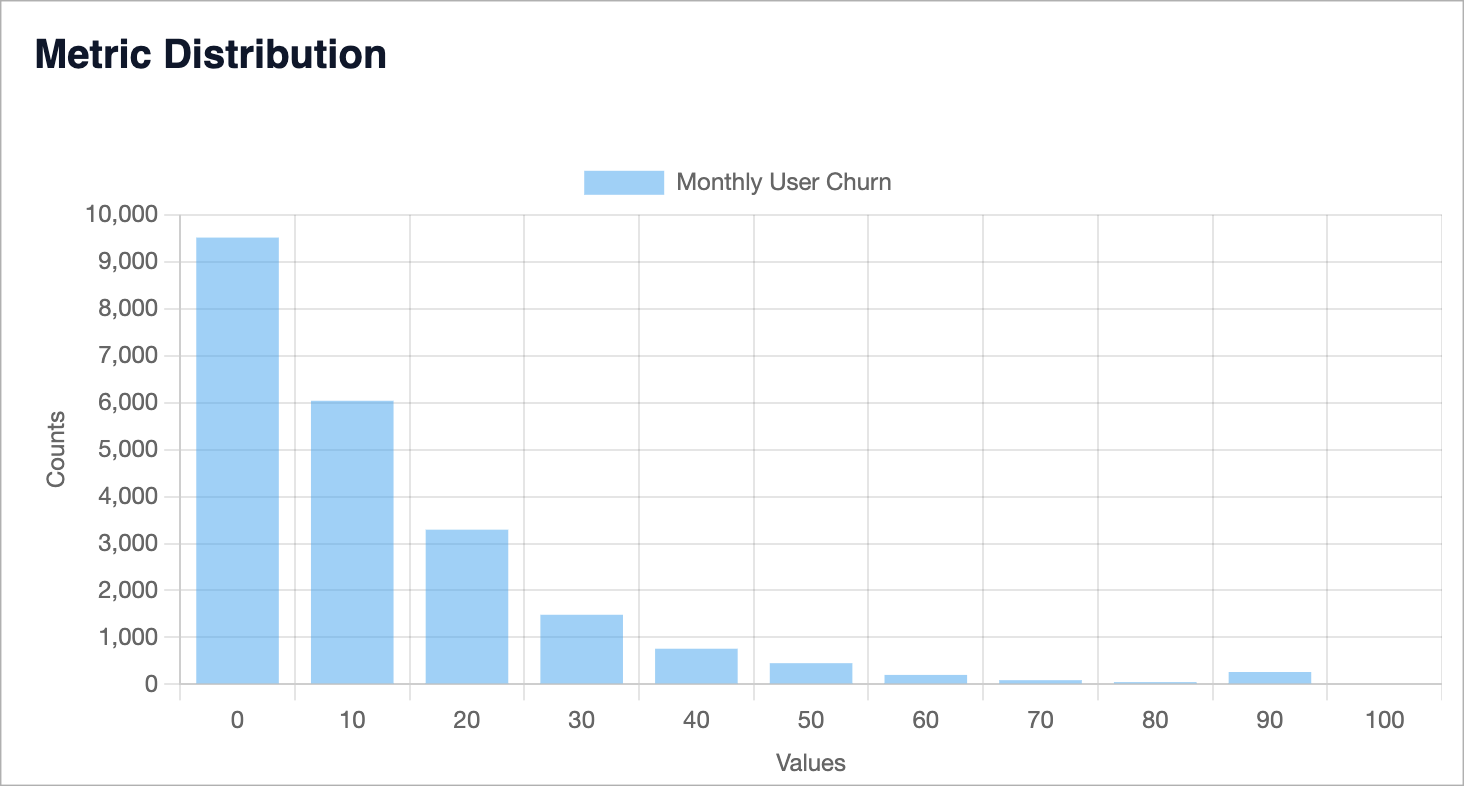
As we can see, most often we can find communities with a user churn rate of less than 10% per month.
- Metric segmented distribution
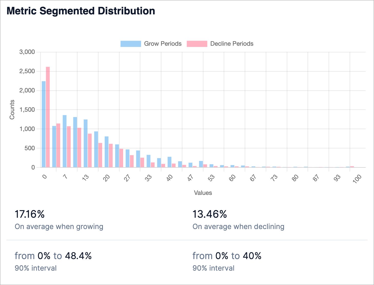
The goal of this chart is to provide a more detailed representation of the metric value distribution. This view has 30 bins, where each bin is represented by two metric values - for the periods of community growth and for the periods of community decay.
In addition to the parameter distribution, there are average values for the periods of growth and the periods of attenuation of communities. In the context of our example, we see that the user churn is higher during periods of community growth. If the churn value in our community were at the level of 16% percent and the community was actively growing, then we could say that our indicator is still better than the average.
- Metric trend
The metric trend shows how the average value of the parameter changes depending on the age of the community.
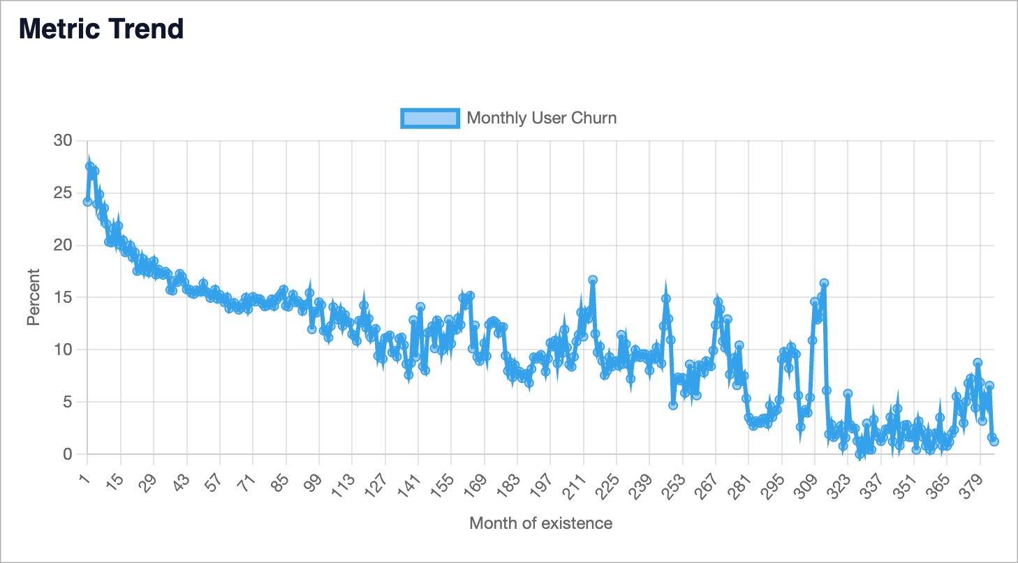
In the context of our example, we can see that over time, the churn in communities declines to some point and then stays more or less the same. (The large variation at the right side of the chart is due to the smaller data set: there are fewer communities that have been around for more than 10 years than those that were launched more recently.)
With the help of the charts described above, you can easily assess how effective your community initiative is. These charts are how I approach such assessments. If you have ideas on how to improve it, I’d be glad to hear them!