To know exactly what is happening in a community, it is necessary to regularly measure various indicators (and for a deeper understanding, also compare them with industry benchmarks). The more active your community is, the more critical the role of measurements is. I am sure that every community manager understands the importance of using metrics, but not everyone can measure them. If you are one of these people who do not have time or cannot do measurements themselves, we have prepared more than 70 metrics (and we are constantly adding new ones to this list), which we measure for your community automatically. All you need to do is to create an account on app.practical-cm.com and enter the URL of your community. A little bit of waiting for data collection and calculation and voila, you have all the metrics for your community.
What do the metrics look like?
In general, any metric is a measurement that answers a specific question of interest. In our app, metrics consist of four things:
- A description of the metric that explains why the metric is needed in the first place.
- The question a metric answers.
- A list of steps that need to be taken to do the measurement.
- Visualization of the metric’s value in the community of a customer.
- Visualization of the industry average (the benchmark).
The description, question and steps are simple text fields. Visualization of the industry average is discussed in detail in another article. So let’s look at visualization of the metric value in customer communities.
Visualization of the metric value
Most metrics are presented in the form of the following charts:
- Average value.
- Metric trend since the start date of measurements.
- Community scores, which show the change in the trend score relative to the industry average
- Distribution of the metric values.
Average Value
The average value is exactly what it says, the average value that the metric takes over the entire lifetime of the community. For example, if we were measuring the number of active users in a community and the community was three months old with a metric value of 40 users in the first month, 60 users in the second month and 70 users in the third, then the average value would be 57, since (40+60+70)/3 ~ 57.
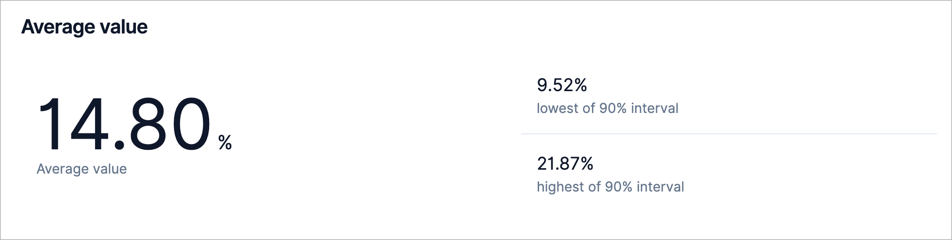
In addition, the application provides boundaries for the 90% interval. The 90% interval is the interval where 90% of all metric values fall (ie. except the smallest 5% and biggest 5%).
Metric Trend
The metric trend shows the change in the metric value over time.
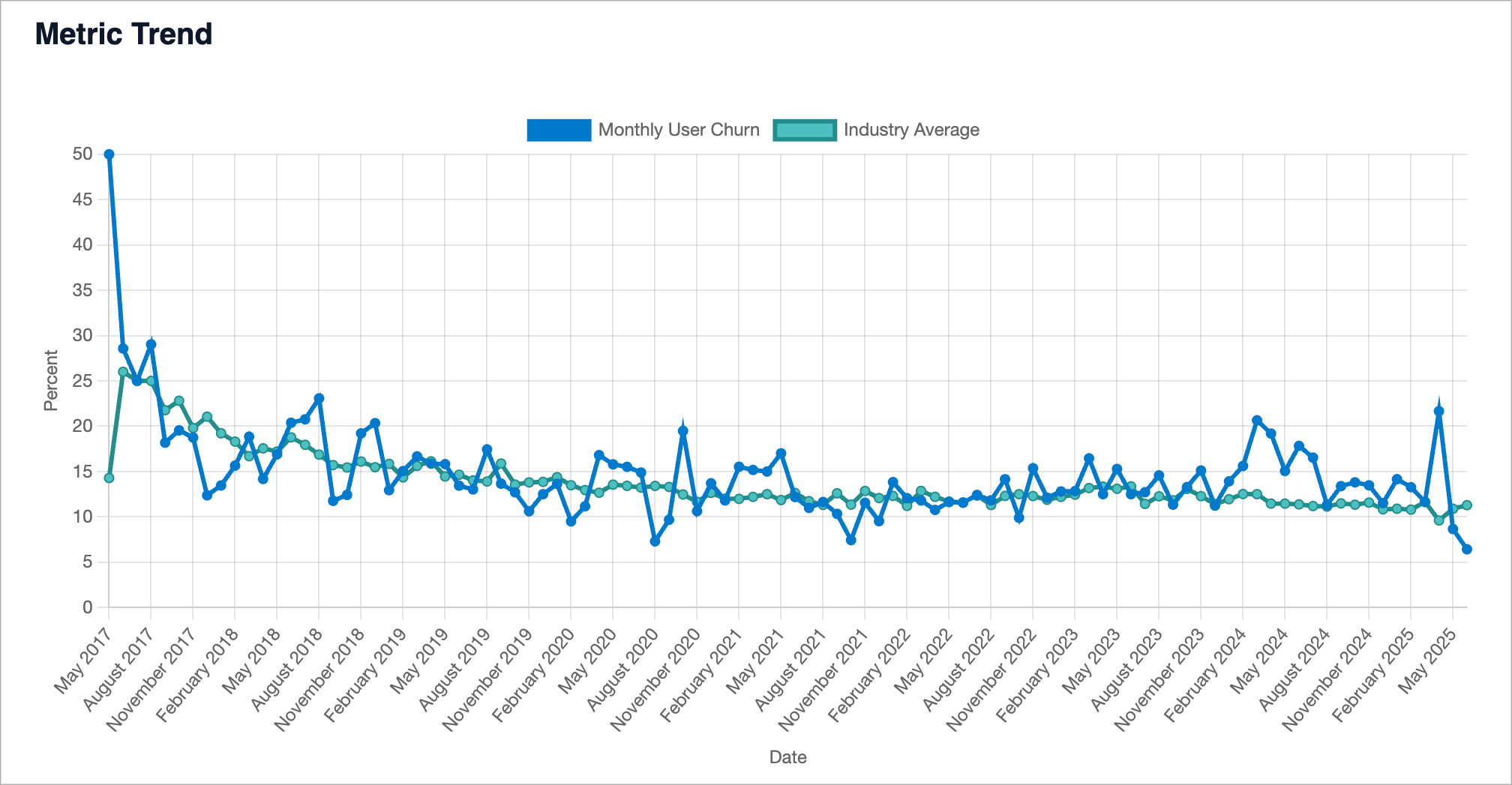
The score is built as follows.
Imagine we are measuring the number of monthly active users. Let’s say you had 70 users last month. Let’s say our benchmark dataset has information about the number of active users in 100 communities. We measured the metric in all these communities and saw that all communities have different values in the range from 1 to 100. In this case, the score of our community, with 70 active users, would be 70, because the metric value in our community is higher than 70% of the benchmarked communities.
In other words, the score tells us how many communities (as a percentage) have a metric value lower than your community.
Whew, that’s not easy to grasp, I know, but please try to understand the idea behind the community score, because it tells us how good a value your metric is.
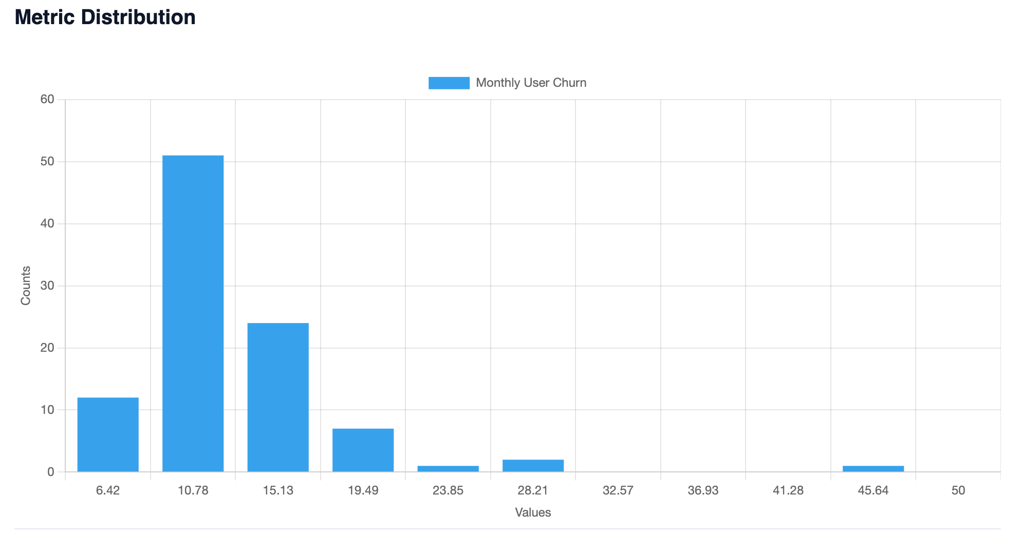
Distribution of metric value
If the average value indicates the middle of the interval of all possible values, then the distribution allows us to see how the values are located throughout the whole interval. That is, how often and what values the metric takes.
What metrics are available?
The full list of metrics is available in Metric Explorer. You can scroll through all the metrics or use the search.
If you would like us to add other metrics, please email me at nicolas.chabanovsky@gmail.com